Card Library: 20 KPI card designs in Power BI
KPI cards are the first thing anyone reads on a report page, and the visual most often left at its defaults. This library collects twenty custom card designs I built with the modern card visual, each one styled to show a value and its variance indicator a little differently. The goal was simple: prove how far the native formatting options can go before you ever reach for a custom visual.
Vertical layouts
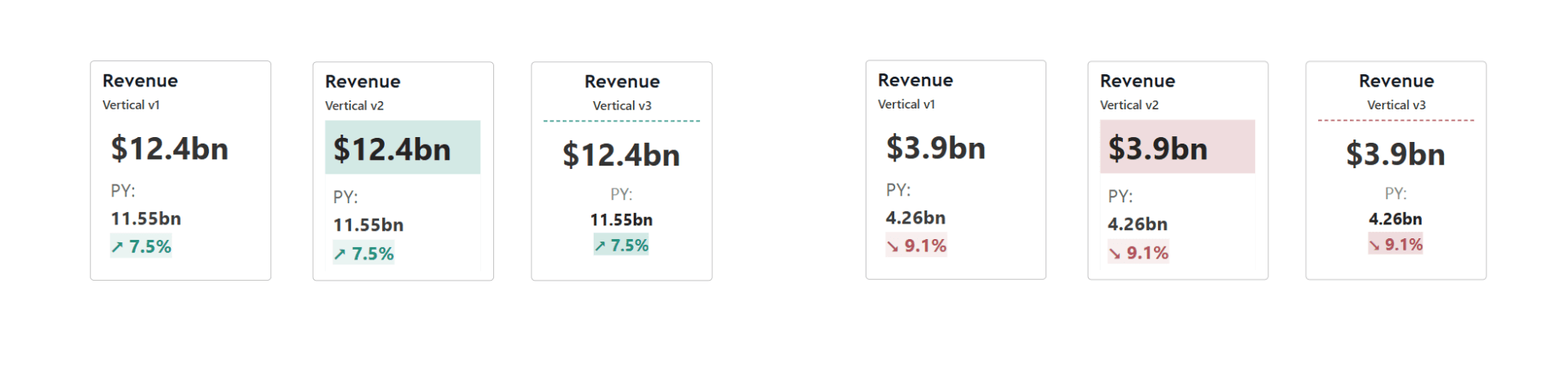
Three vertical arrangements (v1 to v3) exploring where the variance belongs relative to the value: under it, beside it, or framed in its own zone. Vertical cards suit narrow columns and mobile layouts, where the value needs to dominate and the variance reads as a secondary line.
Indicator styles
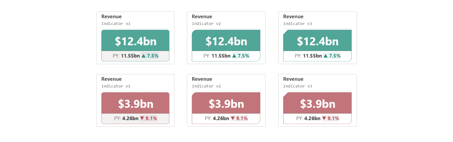
Three treatments for the variance chip itself: a plain rectangle (v1), a rounded rectangle (v2) and a snipped tab (v3). The shape is set through the card’s callout styling, not an image, so it inherits theme colors and conditional formatting like any native element.
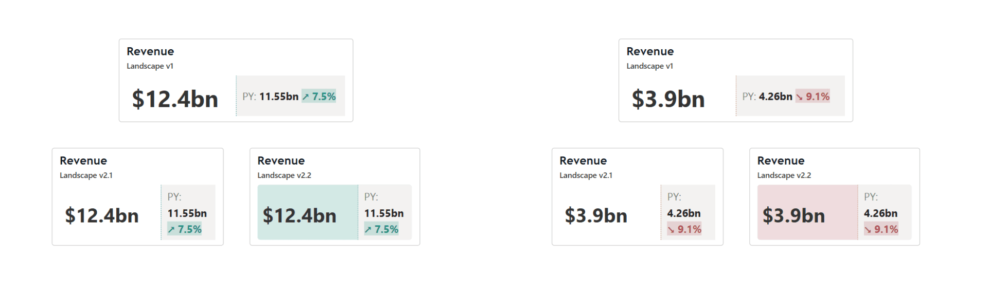
Landscape variants
Wide cards (v1, v2.1, v2.2) for dashboard headers, where several KPIs sit in one band. The variance moves to the right edge and the label takes the top line, keeping a steady reading rhythm across the row.
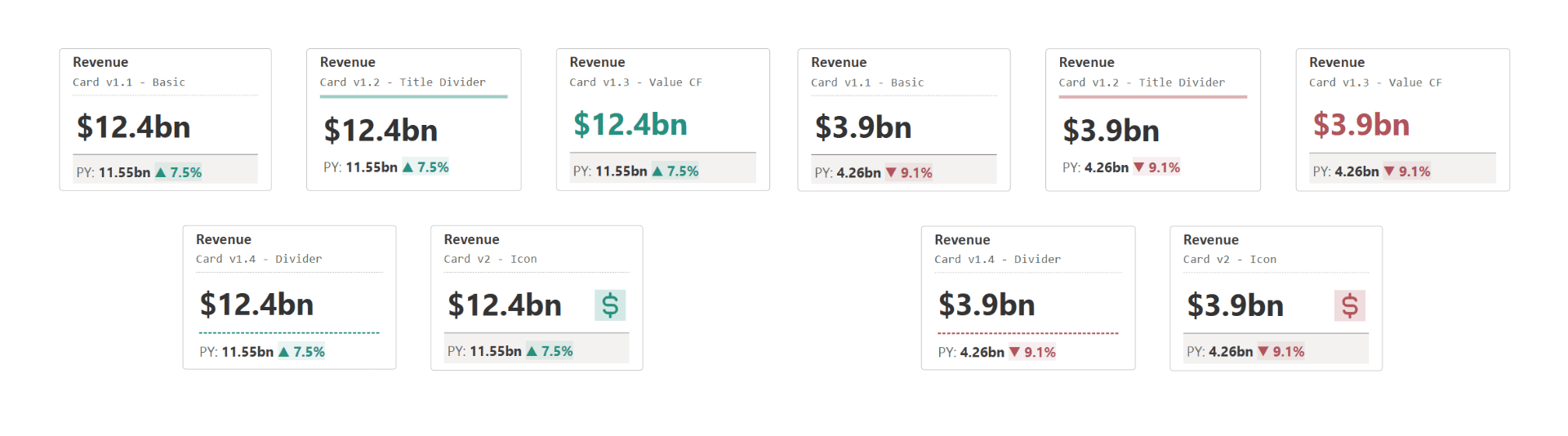
Card series 1: styling the fundamentals
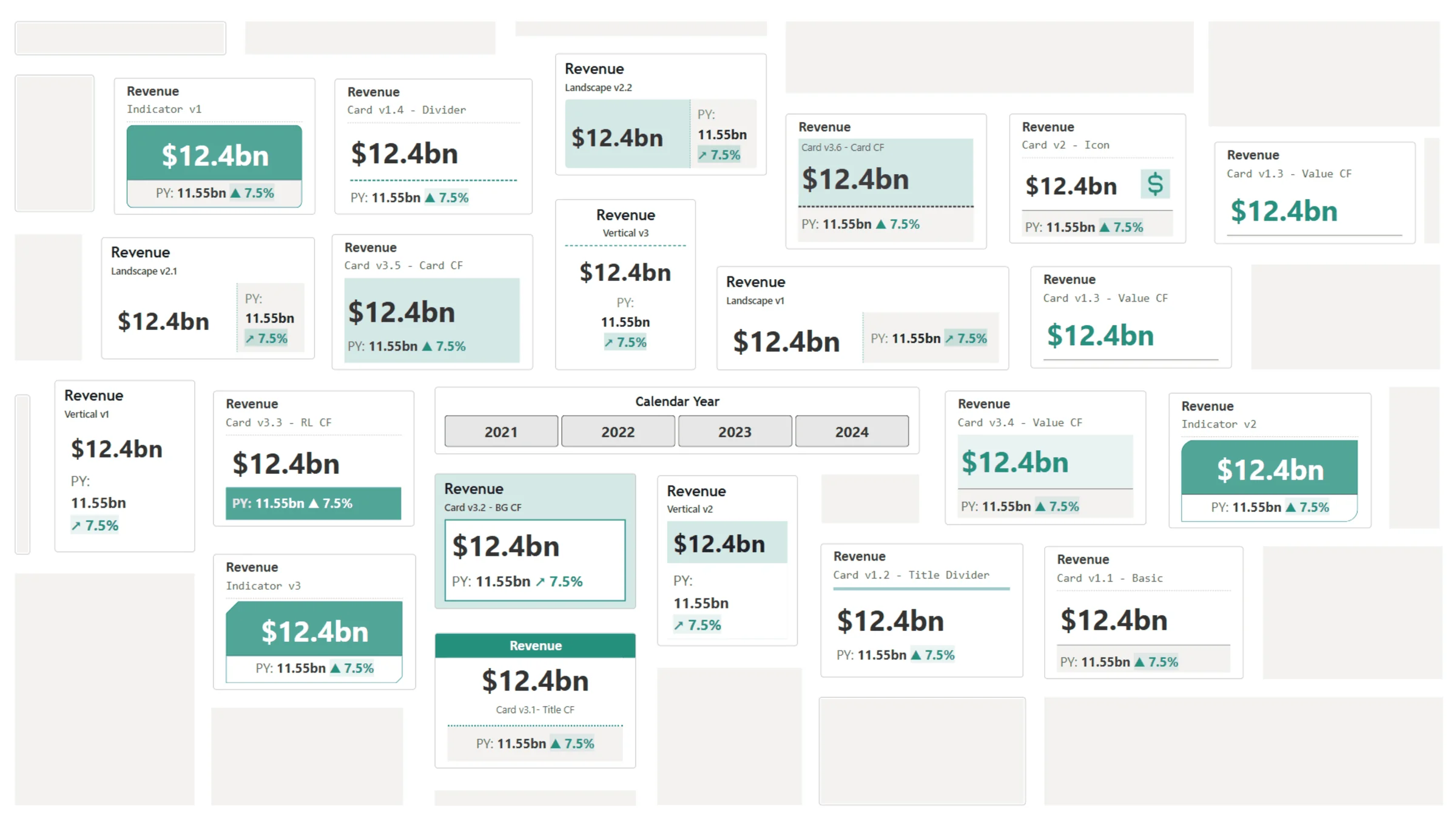
From a basic card (v1.1) up to an icon card (v2): backgrounds, borders, dividers, spacing and image slots. Nothing clever yet, just each formatting group doing its job. If you only take one page from the library, take this one; it is the grammar the rest builds on.
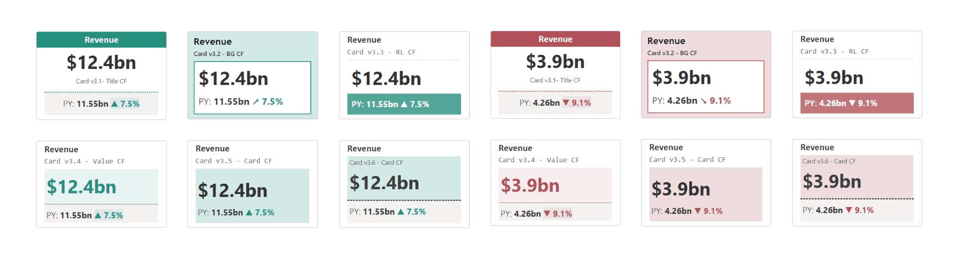
Card series 2: deep dive into conditional formatting
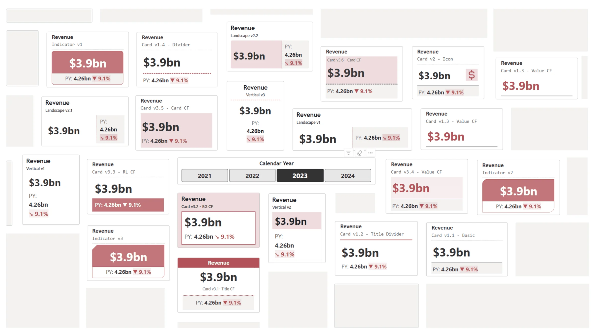
Six variants (v3.1 title CF through v3.6 card CF isolated) where conditional formatting drives the design: title color from variance, callout fill from thresholds, and finally the whole card surface responding to the measure. The isolated variant keeps one element reactive while everything else stays calm, which in practice reads much better than coloring everything.
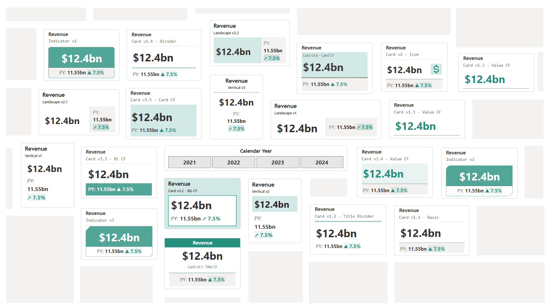
The master gallery
The last page lays out all twenty cards together, which is how the library is meant to be used: open it next to your report, pick the variant that matches your page’s density, and copy the formatting over.
Final thoughts: the future of cards is flexible
The modern card visual quietly became one of the most capable visuals in Power BI. Every design here is native formatting, no custom visuals and no SVG tricks, which means every one of them survives theme changes and tenant policies. If you build a variant of your own, I would genuinely love to see it.
The library, page by page